点击查看上线项目仅限移动端
布局方式:bootstrap+CSS3媒体查询
学习移动端布局方式参考博客地址
一
在线代码展示
flex布局(移动端布局)
1
2
3
4
5
6
7
| .box{
display:-webkit-flex;
display:flex;
}
.in{
display:inline-flex; #行内元素也可以flex 布局
}
|
注意,设为 Flex 布局以后,子元素的float、clear和vertical-align属性将失效。
容器的属性
- flex-direction #方向
- flex-wrap #换行
- flex-flow #简写
- justify-content #左右对齐方式
- align-items #上下
- align-content #多轴线对齐
项目属性
- order #从0开始 排序
- flex-grow #所占空间比例放大
- flex-shrink #所占空间比例放小
- flex-basis
- flex #简写
- align-self
参考Demo
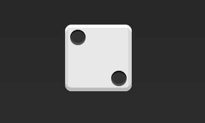
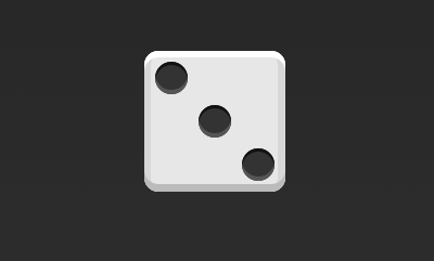
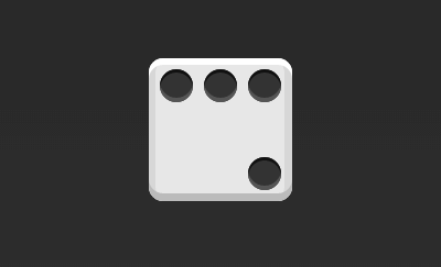
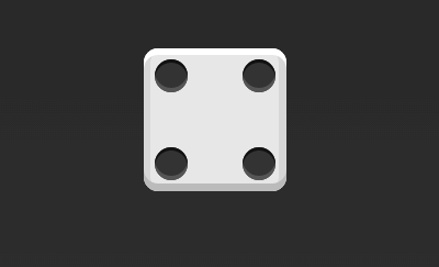
九宫格布局
1
2
3
4
| .box{
display:flex;
justify-content:center;
}
|
1
2
3
4
| .box{
display:flex;
justify-content:flex-end;
}
|
1
2
3
4
| .box{
display:flex;
align-items:center;
}
|
1
2
3
4
5
| .box{
display:flex;
align-items:center;
justify-content:center;
}
|
1
2
3
4
5
| .box{
display:flex;
align-items:flex-end;
justify-content:center;
}
|
1
2
3
4
5
| .box{
display:flex;
align-items:flex-end;
justify-content:flex-end;
}
|
1
2
3
4
| .box{
display:flex;
justify-content:space-between;
}
|
1
2
3
4
5
| .box{
display:flex;
flex-direction:column;
justify-content:space-between;
}
|
1
2
3
4
5
6
| .box{
display:flex;
flex-direction:column;
justify-content:space-between;
align-items:center;
}
|
1
2
3
4
5
6
| .box{
display:flex;
flex-direction:column;
justify-content:space-between;
align-items:flex-end;
}
|
1
2
3
4
5
6
| .box{
display:flex;
}
.item:nth-child(2){
align-self:center;
}
|
1
2
3
4
5
6
7
| .box{
display:flex;
justify-content:space-between;
}
.item:nth-child(2){
align-self:flex-end;
}
|
1
2
3
4
5
6
7
8
9
10
11
| .box {
display: flex;
}
.item:nth-child(2) {
align-self: center;
}
.item:nth-child(3) {
align-self: flex-end;
}
|
1
2
3
4
5
6
| .box {
display: flex;
flex-wrap: wrap;
justify-content: flex-end;
align-content: space-between;
}
|
1
2
3
4
5
6
7
8
9
10
11
12
13
14
15
16
17
18
19
20
21
22
| <div class="box">
<div class="column">
<span class="item"></span>
<span class="item"></span>
</div>
<div class="column">
<span class="item"></span>
<span class="item"></span>
</div>
</div>
.box {
display: flex;
flex-wrap: wrap;
align-content: space-between;
}
.column {
flex-basis: 100%;
display: flex;
justify-content: space-between;
}
|
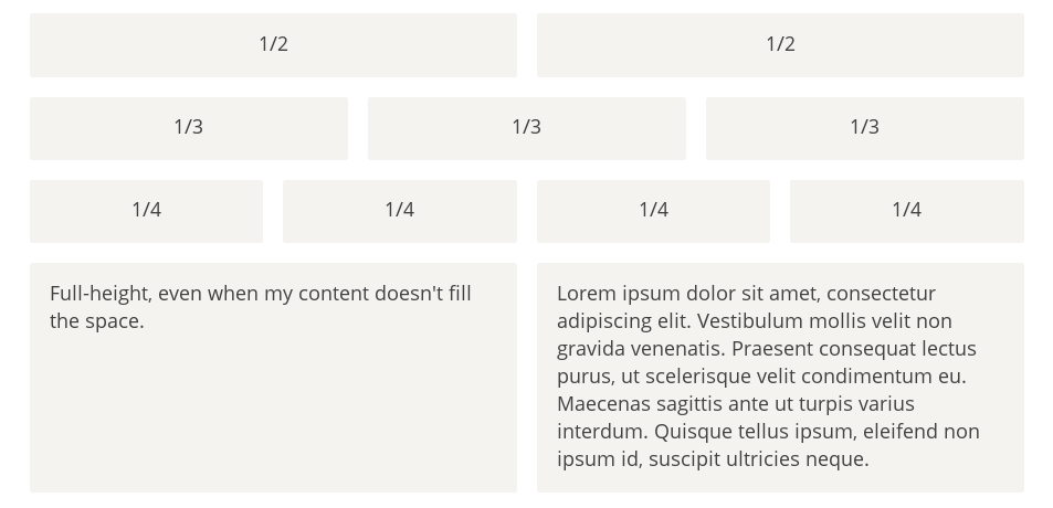
#### 网格布局
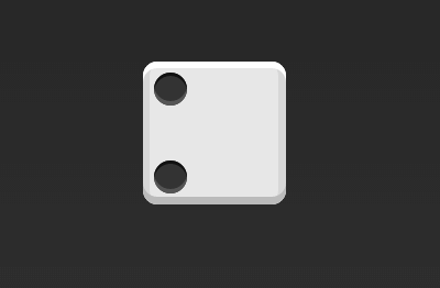
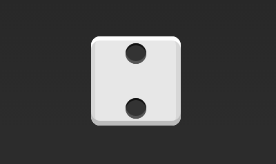
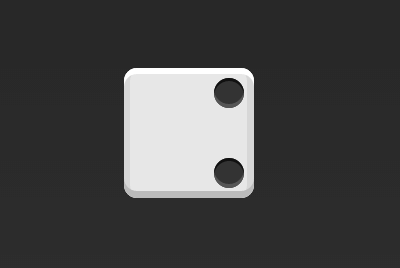
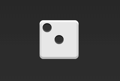
最简单的网格布局,就是平均分布。在容器里面平均分配空间,跟上面的骰子布局很像,但是需要设置项目的自动缩放。
基本网格布局
1
2
3
4
5
6
7
8
9
10
11
12
13
14
| <div class="Grid">
<div class="Grid-cell">...</div>
<div class="Grid-cell">...</div>
<div class="Grid-cell">...</div>
</div>
.Grid {
display: flex;
}
.Grid-cell {
flex: 1;
}
|
百分比布局
某个网格的宽度为固定的百分比,其余网格平均分配剩余的空间